 |
Could we finally have a competitor to The Sims? (Paralives)
Official website: https://www.paralives.com
Forums: https://forums.paraliveshub.com Developer's Twitter: https://twitter.com/_amasse     From the developer:
Quote:
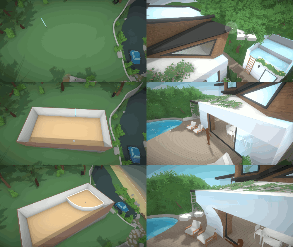
I really hope this takes off! The building mechanics look years ahead of TS4. This is very early in development. I will update this post with new info when it arrives. |
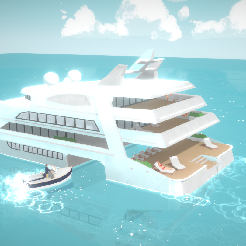
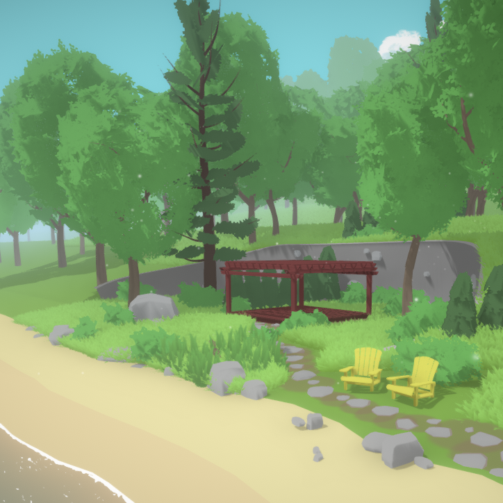
The building looks amazing and very flexible. That art style though? Eh... flat and boring cardboard pseudo-cartoon.
I hope it's just temporary place holder. |
Yeah, the graphics look really cheap, even cheaper and less detailed than The Sims 4 and that is saying a lot. Nevertheless, it is neat someone is trying to make a competitor. I mean open world and seasons from the very beginning. None of that usual BS that EA pulls on us. I hope the gameplay and mechanics are up to snuff.
|
Doesn't look quite like a competitor to any of the 4 sims games - at least not yet. The artstyle is much too cartoonish and one-dimensional in the textures for my taste (maybe even worse than TS1), and the animations don't look particularly good (look at the human behind the dog in the first link - the hands go right through the legs when leaning forward, and the leaning is very static done entirely through moving the lowest part of the back, not even close to how a person would move - maybe it's an animation issue in progress of being solved, but it's difficult to tell, since there's a T-pose character without clothes in front of the house). So for now I'd be quite leaned back in the hopes of this one taking over the Sims industry.
When that's said, it looks fine for being an Indie game, and there may be some hopes for it. Not, however, if this is the artstyle he's going for. Too simple and flat, unless it's meant to be a Facebook game or some such. |
You make it sound like TS1 had bad textures. I'd argue the opposite that TS1 actually had the second best texture work in the series after TS2. And TS1 objects still look the most detailed and realistic to me. But there really is no need to put down a classic tittle in an attempt to express your dismay over the art style of a very loosely related single-person indie project.
|
Quote: Originally posted by HarVee
If this is still on kickstarter/patreon/whatever asking for money to support the idea, this is completely normal. Compare Hat in Time's prototype: https://www.youtube.com/watch?v=bGlCcmI20EM To the actual game release: https://youtu.be/6DQgsyTifcA?t=1m18s Or compare this: https://youtu.be/L5mjqeuxlig?t=2m with this: https://www.youtube.com/watch?v=V7bCmQ-PlVo Or this: https://youtu.be/L5mjqeuxlig?t=3m36s with this: https://youtu.be/9_WX52cA9EI?t=14s The soundtrack really stands out as being drastically different too because the final game's music is fantastic while the tunes from the early builds are easily forgotten. Thing to realize is just the development time of games. Those early builds are from 2012 whilst the game itself released in 2017. As such, this game here would never be a threat to Sims 4, but rather Sims 5 and the next generation. |
Well that's why I'm hopeful it's a place holder.
|
I agree the graphics & characters do need work. The project is probably still in its infancy, but at least the building mechanics look promising. Looking at the graphics, perhaps they're going for a cell shaded style? It reminds me of Breath of the Wild which is an incredibly beautiful game in my opinion. Could this art style work for a life sim game though?
 All in all, I'm excited to see this. Competing with TS is an incredibly difficult venture, but is sorely needed. |
Quote: Originally posted by DeservedCriticism
This is infact on patreon. Link for anyone interested here |
I have no idea why people have a problem with the artstyle??? It's not The Sims, you are not to expect The Sims from this one. It's an indie game having common gameplay elements with The Sims but, it's not the game you are accustomed to, so.. really, the artstyle, given that it's being worked on by one or 2 people is, ok. It's probably going to improve, but it won't be The Sims... Honestly, Sims community is so ungrateful and bitter.
|
Actually if "poor" graphics are simple enough, then my imagination can fill in the blanks and I can still immerse. The problem with the Sims poor graphics is they are kind of in your face and inconsistent. For example in the recent Island pack, someone has taken real trouble with the sand, but then there is this flat crazy paving texture that looks like printed hardboard for them to walk on in the nearby bar, and grass that looks like it was color-washed with a huge wallpapering brush. And the chunky furniture is like they used 4x4 timbers for the chair legs. At least if things are a consistent level of finish and in proportion you are not jerked out of your suspension.
Sadly I doubt whether this will ever be completed. |
Meh. This without live mode isn't saying much, and I do get it isn't the irriational step taken. House as important for interacting.
Cool for resizing windows and curve rooms, but if you can't explore the house with revision of improved actual smarter upgraded "Sims" than that doesn't mean much. I only see a interior house builder simulator. |
Quote: Originally posted by Inge Jones
I wish the creator luck though. Any thing that might shake EA's complacency is a very good thing. Let's hope he/she doesn't accept a take over deal which then shelves the project. (or is this what it is aimed at)? PS: Somebody at EA/Maxis is following him on Twitter.........  :D :D |
Oh god. This reminds me of that time I thought I could create a life simulation game with all the programming by myself.
Remember Untitled Life Sim Project? Speaking from past experience, this is way too ambitious, period. Getting something to work at all is hard enough, but getting it to look perfect and not a horrible janky mess takes an impossible amount of patience. Good luck to the creator though. |
I love the idea and I wish the creator much luck and hope he finishes with a strong game. I'm not going to have sims expectations as this is not the sims. I will come in with an open mind to his take on a life simulator. I feel like a mistake people will make is trying to compare it to The Sims franchise once it's completed. And speaking of the art style I love breath of the wilds style. It's different. I'm going to keep looking into this project.
|
The first gif is fantastic - round walls! Haha.
The art direct leaves a lot to be desired, but it'll be interesting to see if anything comes of this. |
At the very least, this looks like it'd be an AWESOME building simulator.
|
Quote: Originally posted by simmythesim
I disagree. Look at what little Sims 4 has accomplished. I mean as someone pointed out, can we really criticize these graphics as "worse" given the abominations that are animals in Sims 4? Sims 4 is basically leaving the franchise wide open with no one to guard it and plenty of chances for someone to attack and take over. Even if the first project were to be "ok," thing is most of us would probably bet on the ok indie product improving with experience over EA suddenly growing a brain and undoing all their bad practices that they've honestly been doing for over 10 years now. (cause let's be real, even though Sims 3 turned out ok in the end, it sold out hard too to shitty practices) Likewise, as of the past ~2 years I've been pretty impressed with the Indie community. Stardew Valley replaced Harvest Moon, Hat in Time is the first and only platformer I've ever seen that honestly feels like it could take a run at Mario with enough polish (no small feat; Mario is a titan and I believe his franchise is larger than the next three combined), and Kenshi for example built a pretty big world with complex systems with a small team. My Time at Portia is great too and finds a nice balance between Stardew Valley and exploration. The decision to go for cell-shaded graphics is smart too because those age the least. Look at games like Wind Waker and Team Fortress 2. Do you look at those and feel the graphics look dated? They don't, because they went for a cartoonish style and cartoons aren't something that improve as graphics improve; they just remain constant in quality and design and they're a smart move for a starter company like this. If anything, I see the graphic choice and think the person behind it might know what they're doing and had the foresight to plan it this way. I just feel like we can say "it's impossible" til we're blue in the face, but honestly...? What have we got to lose? Harvest Moon and Sim City are already examples of ambitious games that were dethroned, and when a game like Hat and Time can establish itself enough that it can manage to co-exist on the same market as Mario himself? Yeah, anything's possible with a passionate team. |
Whne the title says "do we have a competitor to The Sims?" it's quite natural to compare it to the Sims franchise. I don't think it has quite the potential to go beyond Sims, but it's very well possible it could be a good standalone game. I'm not a fan of the artstyle, so I hope the textures and sim/pet meshes are placeholders, and that the animation is a work in progress. I guess they're trying to finish up the surroundings first, since which is why the sims and pets and various ot her items look unfinished.
|
Quote: Originally posted by simmer22
To be fair, the title itself was made by whomever made this thread not the actual creator of the indie game. I think it is a bit early to start saying does it have a competitor, but its truly nice to see someone trying the field with their own version of a simulation game. |
Looks bad and kinda looks fake...
|
I will keep close tabs as it progresses.
|
Quote: Originally posted by Jonni8
I also noticed the similarities to the cell shaded style of botw. That game is an example of how to do that style the right way, it’s a gorgeous game. I’m not opposed to any particular art direction, I actually liked Sims 4’s art direction before they butchered it pre-release trying to add more realism. Personally I am more interested in the potential of the game moreso than the art style they have. Graphics, to me, never really make much of a difference for a game that’s fun to play. |
Same. Graphics/artstyle second, gameplay first for me.
|
Yes graphics second, gameplay first....within reason.
Right now the humans in the screenshots seem too simple for me. On the other hand the dog does look alright. Let's see what, if anything, comes from it. |
| All times are GMT +1. The time now is 12:00 AM. |
Powered by: vBulletin Version 3.0.14 · Copyright ©2000 - 2024, Jelsoft Enterprises Ltd.