#4

17th Feb 2019 at 3:35 PM
Last edited by simmer22 : 17th Feb 2019 at
10:31 PM.
Posts: 12,928
Thanks: 3 in 1 Posts
3 Achievements
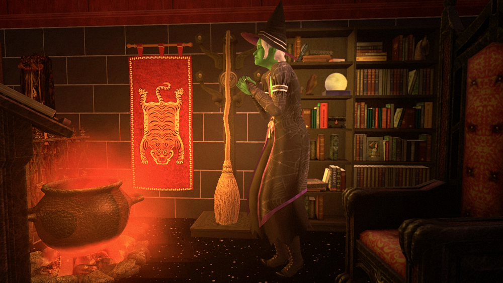
I do like the light and colors, and the idea behind it is good. There are some things that can be done better or different, though.
The angle is a little awkward. I'd probably aim for something from the front, 3/4 view or even back. Sometimes it works to chop off top of the head/hat of the subject in the frame, other times not, but for full-body shots I'd say not. If the person is in the middle of the shot they can almost look like a "barrier" and it creates two "rooms" in the picture. Personally I prefer to have some air above their heads in long shots, so the room looks more whole.
Personally, I like to have the sims facing in the direction with the most air. if they've got more air behind them than in front (unless there's a clear reason), it often looks like they're not the focus of the picture and/or are heading away, or that they're interacting with something outside of the picture. For very wide-screen pictures, you may need to place them a little more to the right or left to get a good balance in the picture.
The witch also look like she's praying or perhaps is worried. Not sure if that's what you're after, but if there is a witch in the room it would look better if she's got a purpose, perhaps doing something "witchy", like stirring in the pot or reading the spell book. Her outward look fits into the scene, but not the pose. Perhaps try a different floor, too - the star floor kind of makes it look like everything is floating. A dark wooden or stone floor might ground her better in the room.
With everything else going on, the broom does get more of a background element feel, rather than beeing highlighted. Perhaps have the witch admire it or interact with it somehow? The eyes are often drawn to areas that are bright, colorful, have high contrasts, or are interesting. The broom is bright, but is still a bit overshadowed by the very bright cauldron and the red tiger wall hanging. I had to read that it's meant to be a tribute to the broom to understand that's what you tried.
EDIT:
If you want to keep the elements, maybe get a bit more focus on her face - the green among all the red and black can also be one of those contrasting points, but on that angle it's not the first thing you notice. Perhaps cut down a little bit on the sides, too? You may not need the entire bookshelf and chair in the picture, just a smaller piece of each.
I tend to use the snapobjects cheat for what it's worth. You could put the elements a little closer to the witch, or perhaps further back in the picture. Maybe turning a few of them around so you see the details, like the spellbook.
The angle of the picture makes the room look like it's tilting down a few degrees toward the left, particularly when using that floor where there's no lines that balance the angle. You'll maybe want to straighten this up a little bit. Angled shots usually work better if they've got a purpose.

 Sign in to Mod The Sims