Quick Reply
Search this Thread
Scholar
Original Poster
#1 Old 30th Aug 2006 at 6:30 PM Last edited by Sisaly : 5th Sep 2009 at 12:50 PM.
Default Sisaly's Upload Approval/Contest Picture Tutorial *Updated to TS3**Updated 8/14/09*
Sisaly’s Picture Taking Tutorial

Some of you are wondering, “How do people get their pictures so big and how do they get such good angles??” Well I’m here to help out!

First Rule of picture taking is: USE THE TAB KEY!!
This enables cameraman mode. Play with it and get familiar. Once you’ve hit the tab key, the trees and lights will appear, instead of fading out if you have Hide Objects Enabled. Use the “q” key to lower the camera, and “e” to raise it. The “z” key will zoom in and the “x” will zoom out. The arrow keys will move the camera left to right and back and forth. Use the mouse to further line up the shot. When you are ready the “c” key takes the picture. Press tab again to exit the camera mode. Any questions so far??

Good, now let’s delve deeper into the mystery of awesome pictures!
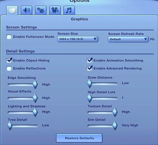
Once you are in game go to the “options” menu. Click on it and find the graphics option. Now we want to set some graphics on high, others we want on low. If you are taking pictures of your sims, there is no need to have Tree Detail and others on high. If you are taking a pic of a house or part of the 'hood then you can tweak the graphics to accommodate that.

Here is how the graphics are in my game. I'd rather my game run faster than see the trees when I'm in Map Mode.


Traditional CameraMode
Now there are two different ways to go from here. I’ll start with the plain ole way. You’ve got the shot lined up and you’ve hit the “c” key and have taken your picture. Now you need to find it. Go to...
My Documents>Electronic Arts>The Sims 3>Screenshots
For uploading please see the tutorial here. I like to use a Camera Hack to make using the TAB key easier, cause let's face it, the 'e' key and others are too broad. I want small movements, not the HUGE range that EA gave us.
So try this camera hack. Be sure to read the Install instruction thoroughly.


Superior Pictures Method
For those of you that have Photoshop or Paint, this is a different, yet VASTLY better way to do your pictures!!
Using the tab key line up your shot and hit the “printscreen” key found next to the F12 key. I recommend using this program, Gadwin, for saving your screenshots to a folder. Now I've found, like many of you that screenshots are horribly dark. Why this happens I have no idea. But I do know a solution. If you see my Graphics pic above you will notice that the Enable Fullscreen Mode box is unchecked. This means that I'm running the game in Windowed Mode. Windowed Mode doesn't take up the whole screen and allows you to easily go back and forth between other programs without closing the game. It also allows you to take screenshots with your prtscn button that aren't dark.
I'm not sure if it's just my pc/monitor but I have to Enable/Disable Fullscreen/Windowed Mode while I'm at the Main Menu, BEFORE going in-game. Otherwise I can't see the box to click to Accept Changes....

Perfect Pictures for Uploads and Contests
Now that we have the basics out of the way let’s explore ways to make your pictures even better.
I think everyone knows how I feel about the lighting on the sims in-game. The best way to get a good picture of a sim is to put them in a room with brightly colored walls and LOTS of lights. I use several overhead, several outdoor lights in a semicircle and a couple floor lamps on each side. Yes, EA really messed up.
If you are doing night time pics, make sure to use plenty of strategically placed lights. They can really make your pic stand out. Play with different kinds of lights in different positions. Now, I notice a lot of people don’t get in nice and close for their pictures. This is a HUGE mistake. You gotta get in nice and close. If the contest host(ess) asks for a headshot, you should NOT be able to see below the sim's collarbone. With body shots make sure that there is hardly any space between the top of their head and the top of the pic and same for the feet. We don’t need to see 3 inches of the sky over their head.
Professional pictures shouldn’t have plumbbobs, thought bubbles, relationship pluses or minuses, or gridlines. Have your walls up so we don’t see toilets and make sure to be in “live” mode when you take your pics. Unless you have flooring down, the gridlines show. These guidelines should also be used by CC creators. There is nothing worse than a creator that gives us a picture of the sim from waist up from far away to show us their awesome new lipstick.

The Cheats
Now that we are talking about plumbbobs we might as well trot out the good ole cheats.

moveObjects [on/off] the single most important cheat!!!

hideHeadlineEffects [on/off] Hides all Sim overhead effects such as thought balloons and speech balloons.

slowMotionViz [0-8] Puts the visuals of the game in slow motion. Entering a "level" value is optional. Valid values range from 0 = normal speed to 8 = slowest.

Remember that while you are moving an object or sim if you hold down the ALT button it will allow you to place it anywhere in the grid. In other words ALT is snapobjectstogrid false.

Posing

The Overview of this animation hack is VERY long and detailed. The creator has two for download. One with just the animations and one that has everything from Floods to Fires. I'm sure the storytellers out there wept with joy when they were released, but do be careful.
Thank you MondayMorning for helping an old gal out.


Photoshopping


Night Effects by emaone
Photoshopping Poses Part1 & Part 2

Entering a Contest
First things first. BEFORE YOU POST TO ASK A QUESTION ABOUT THE RULES, ROUND OR WHATEVER, READ THE FIRST POST (INSTRUCTIONS) TWICE. 99% of the time the answers are there or in the thread itself. I see it happen over and over.
Use the "title" when you post to put in your sim's name and what round it is. Makes it easier to tell which sim it is for the judges. This is very helpful to do.
Second, don't spam the thread. Really, just don't do it.
Now, sometimes things happen and we cannot go on in a contest. Whatever the reason is ALWAYS PM the host(ess) to let them know. Or at the least, post it in the thread that you are dropping out. People who just don't post their entries and join too many contests just to drop out, get a bad reputation here, real quick.

Paying attention to the little details can set your pic apart from the rest. Use decorations that draw your eye to it...play with color and perspective. I see many people that have a beautiful sim, but the picture is boring, ie..no background decorations. If your sim is posing in a house there should be pictures on the wall and furniture. If they are outside there should be plants, fences and/or walkpaths, maybe a fountain. For plain background pics use white/light colored walls. I strongly recommend that if you want to know what a really good pic is..to look at the closed contest thread or follow a contest you are not in. Check out the top five contestants and you'll see what can help you get past the apps. round. Also, when you enter a contest, make sure your sim is right for that contest and that it's right for you. If it requires lots of dialog and you aren't the snappiest writer, skip it and try another. Above all, JUST HAVE FUN!!!
Now you can take some great pictures!!! Can’t wait to see them.

"Imagination is more important than knowledge. For knowledge is limited, whereas imagination embraces the entire world, stimulating progress, giving birth to evolution." ~Albert Einstein
A conservative is a man with two perfectly good legs who, however, has never learned how to walk forward.~F.D.R.
Advertisement
Lab Assistant
#2 Old 30th Aug 2006 at 6:38 PM
Screenshot Maker is a great little program for capturing pictures. Just run it, press the Print Screen button and it'll save the picture in the folder you want as .jpg, .png or .bmp. It's a lot easier to capture pictures this way and then work with them.
Scholar
Original Poster
#3 Old 30th Aug 2006 at 6:43 PM
Thank you for the link Aijux!! I'm currently in the process of saving for Photoshop so I haven't gotten around to using that program, but I will now!!

"Imagination is more important than knowledge. For knowledge is limited, whereas imagination embraces the entire world, stimulating progress, giving birth to evolution." ~Albert Einstein
A conservative is a man with two perfectly good legs who, however, has never learned how to walk forward.~F.D.R.
#4 Old 7th Sep 2006 at 10:58 AM
could anyone please tell me what you use to pose your sims other than the artistic camera?

thanks a millon because i can't for the life of me figure it out
Banned
#5 Old 7th Sep 2006 at 11:00 AM
I use the Hula & More hack, it's in the Programs, mods and hacks list in the lists forum. Also before I got that hack I just used a mirror and the moveobjects cheat.
Lab Assistant
#6 Old 13th Nov 2006 at 8:48 PM
I have a question! My white walls never come out white after I take a picture. I have all the right lighting but they come out looking grey for some odd reason! I have the walls you have on the front page for download. Alos, I wish they had a post showing us what pose does what! Like a picture post showing us. Thats takes up most of my time searching for a pose I need. Am I making any sense here Great job with this information Sisaly! You can see you worked very hard to help dummies like me! :D
I'm Michele D......
Scholar
Original Poster
#7 Old 13th Nov 2006 at 8:51 PM
I had Gunmods Lighting hack and I noticed that everything is so much darker. I uninstalled it. Also, did you make sure your sim is facing the right way? If you get in-game and put up that white wall paper and the sim is facing the right way, post a pic here so I can see. Maybe after the contest is over I'll post pics of the poses for everyone.

You're welcome Michele!

Edit: The Hula pose is in the 'dance' section of the Hula Hack.

"Imagination is more important than knowledge. For knowledge is limited, whereas imagination embraces the entire world, stimulating progress, giving birth to evolution." ~Albert Einstein
A conservative is a man with two perfectly good legs who, however, has never learned how to walk forward.~F.D.R.
Lab Assistant
#8 Old 13th Nov 2006 at 9:26 PM
I did notice when I pose the sim to take a picture, it seems to come a bit lighter when their in back of the lot-house and not facing the street! When facing the street it comes darker. I will take a picture when I have time and show you what it looks like.

My friend just sent me this and I haven't really looked at it. But I think they show the poses and pictures of what their supposed to do. I don't know if she wants me to say her name out here But she gets the credit for the link!

http://www.sims2wiki.info/Content_L...es%2C_and_Poses

I'm Michele D......
Be like the 22nd elephant with heated value in space, bark!
retired moderator
#9 Old 13th Nov 2006 at 11:17 PM
Hehe, thanks Michele but the people to really take credit are HystericalParoxysm and all of the contributors to that article!

I will choose a path that's clear- I will choose free will
-RUSH- -RADIO- -RADIO- -EON- -ARCHIVES-
Simpeople and Me Archive- 11Dots Archive- My Sims World Archive- Adele Archive- Sims 1 Archive
Please send me a message if you would like a SimsFileShare account, I can send you an invite!
#10 Old 13th Nov 2006 at 11:29 PM
I have a question. When people take their pictures I always see them in poses. How do you do the poses?
Be like the 22nd elephant with heated value in space, bark!
retired moderator
#11 Old 14th Nov 2006 at 2:44 PM
Follow Michele D's link in her post above to find the hacks/ cheats needed for these poses.

I will choose a path that's clear- I will choose free will
-RUSH- -RADIO- -RADIO- -EON- -ARCHIVES-
Simpeople and Me Archive- 11Dots Archive- My Sims World Archive- Adele Archive- Sims 1 Archive
Please send me a message if you would like a SimsFileShare account, I can send you an invite!
Scholar
Original Poster
#12 Old 14th Nov 2006 at 4:13 PM
That's a great article(s). Thank you very much for posting that link Michele!!
And thank you to HystericalParoxysm for the time and effort put into the Sims2 wiki. :clap: :thumb:


Oh, the sun will fall from different angles on different lots. I haven't figured out the rhyme or reason to it, but don't assume, always check. I thought it was always the 'west' side but I've had it come from all four different directions.

"Imagination is more important than knowledge. For knowledge is limited, whereas imagination embraces the entire world, stimulating progress, giving birth to evolution." ~Albert Einstein
A conservative is a man with two perfectly good legs who, however, has never learned how to walk forward.~F.D.R.
Field Researcher
#13 Old 24th Nov 2006 at 4:59 AM
Quote: Originally posted by FireAzor
So do white, grey... every background color is going to leave a little margin of the color you chose around your subject. It takes a little extra time and effort to take it off but it sure makes a difference.


What tools do you use to remove the margin of color? Or better yet, what types of tools...some of us have PhotoShop, others have PaintNet, etc.
#14 Old 24th Nov 2006 at 5:42 AM
Quote: Originally posted by redwing
What tools do you use to remove the margin of color? Or better yet, what types of tools...some of us have PhotoShop, others have PaintNet, etc.


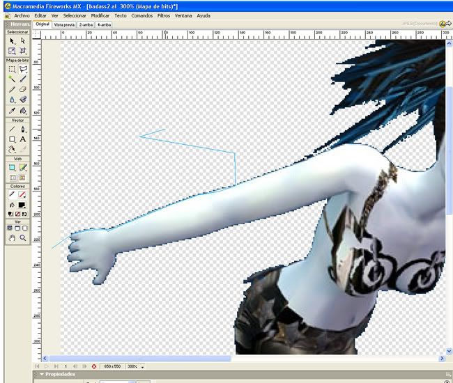
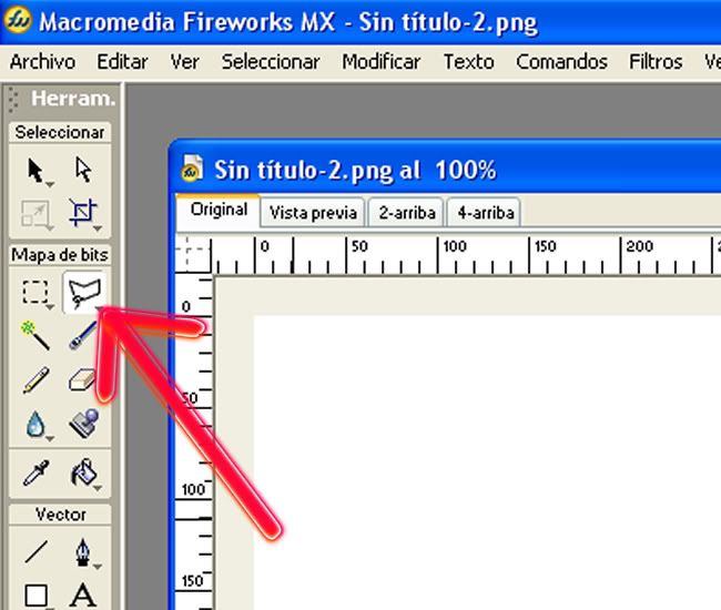
the image editing software I use is Macromedia Fireworks. and the tool I use to remove the color border is called "polygon lasso tool".


I'm not sure of what this tool is called in other image editing programs, but i'm sure you guys have a tool that functions the same way (please feel free to add the names of your tools )

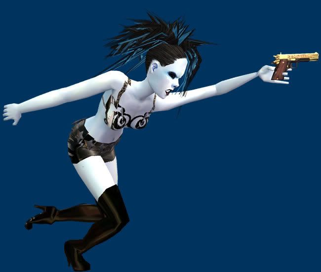
here's how i do it. I'll take one of my previous contest entries as an example. (Sisaly's seen this one, she was/is a judge for the Miss Fantasy Vogue contest Xei is in)

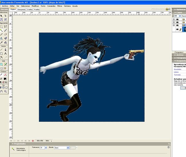
here's a random picture of Xei on a dark blue plain background.


I load it in Fireworks and this is what I get: the same image ready for me to edit.

Ok, what most of us do when we have a picture like that is we take the wand tool and select the solid color and cut it out...


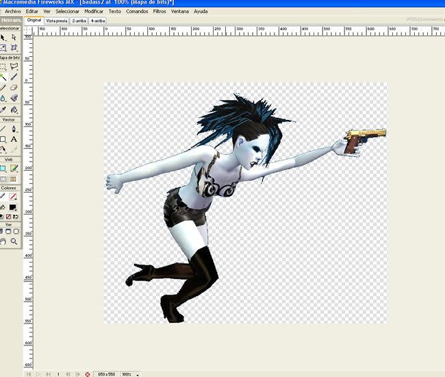
leaving us with something like this:


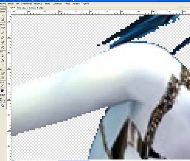
See the really annoying band of blue that's around her... doesn't look so nice with that, and if I were planning to move her to a different background it would look sloppy. So what I do is I get the polygon lasso tool into action and select portions of that color edge and cut them out.


You have to be careful when doing this and for newbies... lol it'll want to make you pull your hair out! (I know that when I was learning how to do this it made me want to do exactly that)... but it's worth it guys, I promise.

Here's a zoomed in look at a portion with the color edge removed looks like compared to another part of her body that still has the color edge.


looks better doesn't it? ok now when doing this (especially the first time) try doing it peice by peice in sections until you get it done. When you have more practice with the "section" technique you can upgrade to doing it all in a whim to save time. Practice makes perfect, try and try until you get it right! I know it's tedious and annoying, but it really makes a difference in your pictures =)

hope this mini tutorial helped someone. And thanks Sisaly (again!) for this greal tutorial =)
Test Subject
#15 Old 24th Nov 2006 at 6:03 AM
Quote: Originally posted by FireAzor
So do white, grey... every background color is going to leave a little margin of the color you chose around your subject. It takes a little extra time and effort to take it off but it sure makes a difference.


Yea, I know how to do that, but there are certain colors that don't do it as annoyingly as some. For instance white and light grey leave a much less noticeable line on a light skintone than dark blue or red does. So the question really is, how does one really know which color will leave the most unnoticeable line.

Bah.
#16 Old 24th Nov 2006 at 6:33 AM
Quote: Originally posted by StephKat716
Yea, I know how to do that, but there are certain colors that don't do it as annoyingly as some. For instance white and light grey leave a much less noticeable line on a light skintone than dark blue or red does. So the question really is, how does one really know which color will leave the most unnoticeable line.


well if you take a picture of your sim ingame with a white/grey background and plan to photoshop her or him onto a dark background... that will obviously stick out like a sore thumb. You've got to be careful when selecting your ingame background colors and the background you're planning to use later on.
#17 Old 24th Nov 2006 at 4:22 PM
I can't afford that program, but in PS Elements, I use the Magnetic Lasso tool, or the magic wand tool on a solid background, other times i just trace with the eraser myself on my wacom tablet..
Scholar
Original Poster
#18 Old 1st Dec 2006 at 1:46 AM
If you use the magic wand, but before you delete the background, right click....there willbe options like deselect. Click on feather and set it to 1 or 2. This will soften the effect of the tool. I used that in this pic.


"Imagination is more important than knowledge. For knowledge is limited, whereas imagination embraces the entire world, stimulating progress, giving birth to evolution." ~Albert Einstein
A conservative is a man with two perfectly good legs who, however, has never learned how to walk forward.~F.D.R.
Test Subject
#19 Old 4th Dec 2006 at 3:27 AM
Thats a GREAT tip, Sisaly. Thanks!


Hey, dunno if anyone has mentioned this. But if you absolutely MUST be in Build or Buy Mode in order to take a pic (like taking a day time pic at night and vice versa) you can click the design tool (I believe it looks like keys.) As long as you don't hover over any objects in game (they'll become seethrough) you get rid of the gridlines.

Bah.
#20 Old 4th Dec 2006 at 11:09 PM
I think i should make my own version of a tutorial for Photoshopping poses, here are some of mine:


CLICK THE IMAGE FOR A LARGER VIEW, it's way better...


Scholar
Original Poster
#21 Old 4th Dec 2006 at 11:14 PM
WHOEVER wants to do it would be great.

Awesome examples Fire and Dre. I just started doing that, so I feel less qualified than others.

"Imagination is more important than knowledge. For knowledge is limited, whereas imagination embraces the entire world, stimulating progress, giving birth to evolution." ~Albert Einstein
A conservative is a man with two perfectly good legs who, however, has never learned how to walk forward.~F.D.R.
Scholar
Original Poster
#22 Old 11th Dec 2006 at 9:11 PM
Default Photoshopping Poses Part 1

Basic Photoshop Posing

You need to know layers to be able to PS poses. This is for Photoshop 7. But I think most everything I use is in Elements.

First thing you need to do is decide how you want the finished pose to look. Since I have these two poses already done, I’ll show them as an example. Once you know what the finished pose will look like, you need to figure out which animations you need. In this first example I used “plead” and ‘checkself out’.

I did the plead pose first, and using slowmotion timed it just right. Make sure the background is not the same color as the sim or the clothes. I lined up my shot. This is where Gunmod’s Camera Hack becomes integral. Without it you cannot get close enough to the ground for some shots. Make sure to save your camera angle by hitting ctrl-4 or 5...up to 9. Then when I did the second pose. I just had to hit four and my camera was in the same position. All I had to was hit the “e” key to raise the camera into the right position.
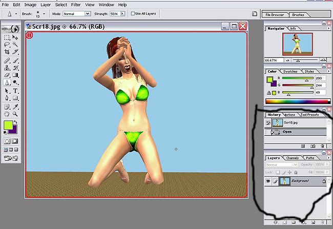
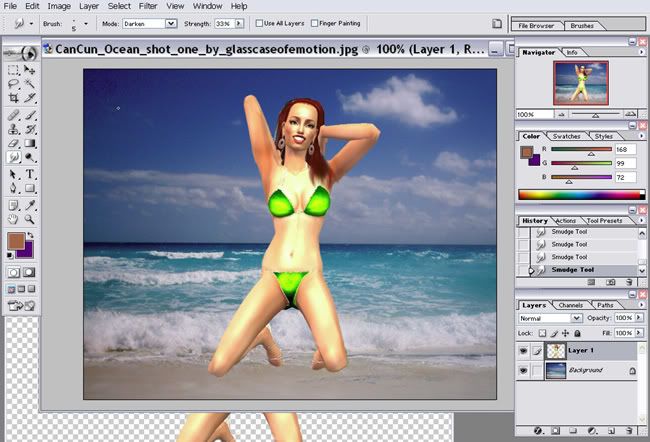
Now that I have the pics, I can do the Photoshopping. Make sure you have HISTORY and LAYERS open. If they aren’t go to WINDOWS on the top row next to HELP. Open history and layers.


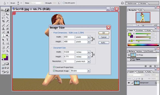
I resized the pics to 650 width. I left constrain Proportions clicked. So when I typed 650 in, it automatically made the height 488. If you don’t want your sim to be that small, you can leave a bit bigger. I just want to make sure that I have the two pics the same size!


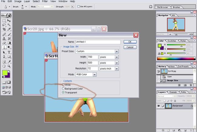
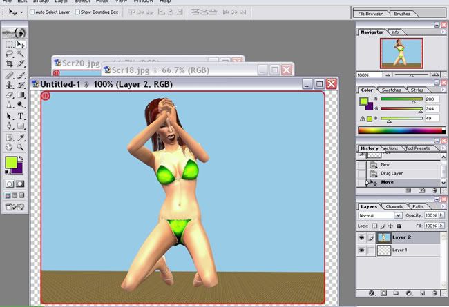
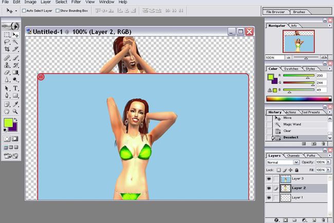
Now open a NEW file that is slightly bigger than your pics. It needs to be transparent. Use the MOVE tool and drag the plead pose onto the transparent layer.


"Imagination is more important than knowledge. For knowledge is limited, whereas imagination embraces the entire world, stimulating progress, giving birth to evolution." ~Albert Einstein
A conservative is a man with two perfectly good legs who, however, has never learned how to walk forward.~F.D.R.
Scholar
Original Poster
#23 Old 11th Dec 2006 at 9:14 PM
Default Photoshopping Poses Part 2
Part2
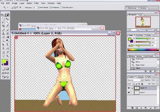
Now break out the MAGIC WAND. Click on the background and then hit delete. My flooring was NOT good for PSing..it wanted to take out half of her legs when I clicked on the floor, so I used a small ERASER to go around the edge of her legs, then used the MAGIC WAND on the flooring and deleted it.


Use a large eraser to get rid of the red line….it may get in the way later. Now drag the ’checkself out’ pic onto the transparent layer.


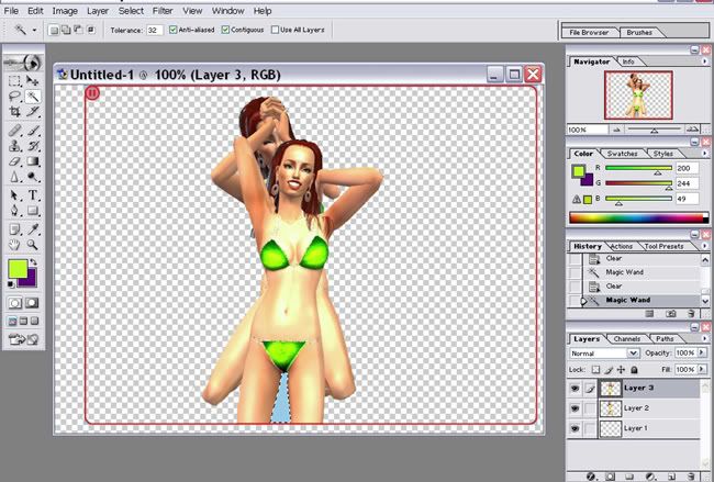
And repeat the MAGIC WAND process.Now set the opacity of the ‘checkself out’ layer to 75 and line up the bellybuttons. I smudged a little around the belly line to blend them together.


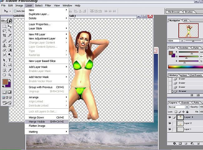
Erase what you don’t need on BOTH layers then MERGE VISIBLE.


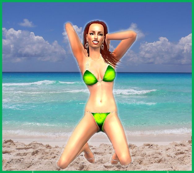
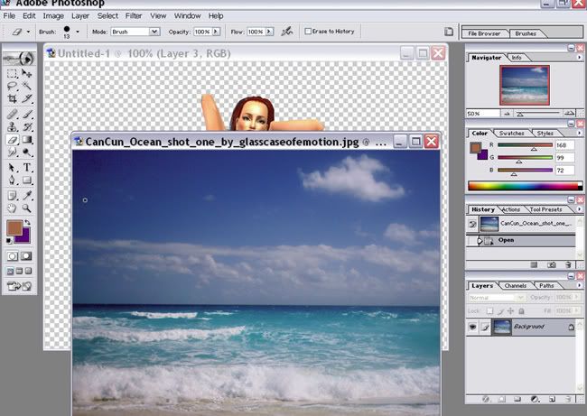
Now all you need is the background pic. Drag the new pose onto the pic and do some finishing touches, like smudging, sharpening and such. VOILA!!


For this pose I did Still Pose>Solo Portrait>Hip Shot(?). For the arm, I did “Rain”. So using the same principles as above you will be able to Photoshop almost any pose. If anyone wants to share posing combinations and the results that would be awesome!!!

"Imagination is more important than knowledge. For knowledge is limited, whereas imagination embraces the entire world, stimulating progress, giving birth to evolution." ~Albert Einstein
A conservative is a man with two perfectly good legs who, however, has never learned how to walk forward.~F.D.R.
#24 Old 12th Dec 2006 at 12:05 AM
Thank you so much sisaly....But (like usual) I am having a little braindead time (again). I actually thought that to have the 2 body piece together, one would have to cut them so to have a bottom half and a top half, and then join them. Obviously reading, that is not the case, so where does it go? So sorry for a really ridiculous question, but I cant get my head around that.
Scholar
Original Poster
#25 Old 12th Dec 2006 at 12:18 AM
Well if you look at the 3rd pic with both poses, what you do is line it up using the bellybuttons. Then erase her legs on the "checkself out" pose, then click on the "plead" layer and erase the top half. It helps if the top layer is on an opacity of about 70%. So you are left with a top half and a bottom half. When they are lined up and erased, then you when you merge it becomes ONE image, instead of two. Did that help???

"Imagination is more important than knowledge. For knowledge is limited, whereas imagination embraces the entire world, stimulating progress, giving birth to evolution." ~Albert Einstein
A conservative is a man with two perfectly good legs who, however, has never learned how to walk forward.~F.D.R.
Page 1 of 2
Back to top