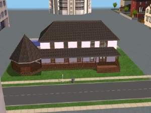
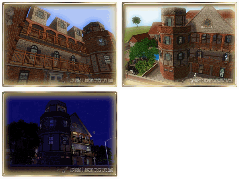
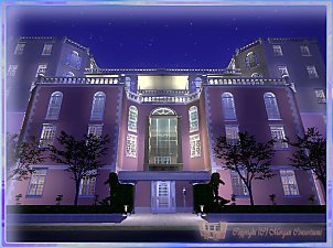
 Netron's Escapade

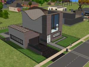
DMT.jpg - width=800 height=600

Ground Floor Plans.jpg - width=1024 height=768

1st Floor Plans.jpg - width=1024 height=768

2nd Floor Plans.jpg - width=1024 height=768
Loading Time: 50 seconds
Saving Time: 1 min 20 seconds
Average Frames per Second:
- 60 frames on Ground Floor /Medium Zoom In/
- 50-55 frames on First Floor /Medium Zoom-In/
- 25-30 frames on Second Floor /Maximum Zoom-Out, No Objects Hiding/
 Remember: You need both the zip files in the download section (Parte Prima & Parte Secunda), otherwise if you don't have the terrains i used, your lot's surface will flash blue as if it was Christmas today
 Start Up:
Hello and welcome to everyone who decided to take the time to look at this lot. What first appeared to be a simple and rather short explication of these lot’s statistics has turned into an extensive essay for the floor plans and the layout. So those of you who want to bear with me through this, be my guests - I’ll try not to bore you too much

Intro:
This house has a long standing history in my game. I remember starting it’s construction way back when i was in high school with just the base game available at the time. Every lot a started on back then, was the biggest lot available, which cost my starter families a lot but proved to be long-term investment. When they got rich over time instead of buying new bigger lots I just expanded their houses on this one. This house has been in the possession of my second family since I started playing Sims 2, the Netrons. They grew up to be quite a dynasty in three years now…
And that’s exactly how many generations of Netrons have past through this house giving it the shape it has today. This house I didn’t just build in a day or two. I continuously built it since I bought the first sims 2. So that’s why, to me, it bears a lot of meaning - because every square was built with the money the Netrons earned over these past years.
History:
The lot started out as a simple shack with a kitchen, small living room and a really small bathroom. Over time I expanded those rooms in space until Nightlife EP came. That brought in the garages. Unfortunately they are designed in such a way that you can’t place them in the far right corners looking from the street (you could use the moveobjects cheat, but you’d be lacking animations). So, I had do transport everything on the right and place the garage on the left. I also had to remove the foundations cause there was no way to merge the garage with a foundation elevated house (there is, reqs cheats and a simple technique, but looks ugly for certain patterned wallpapers). In the fourth generation, I saved up for I second story where I moved the bedrooms, freeing space for the ground floor living area. Eventually I built a third story where again I moved the bedrooms and what was on the ground floor was now on the first floor. Ever since the ground floor is empty and I never furnished it since…
Layout:
I moved Netron’s Escape in the downtown subneighborhood after Nightlife EP. Imagine if we could move our homes in real life -just--like--that- (I am, of course, talking about houses, not RVs). So as such this house had to have an urban downtown look. That’s why I removed the sloped roofs and went with the flat option. I experimented with this a little. Tried placing the roof two squares away from the edge and bordering it with a fence but that came out too baroque, so I erased the whole slope.
As I said previously the ground floor’s western section is now empty. You could leave it as such. Maybe throw in a couple of decos and turn it in to a stylish entrance foyer. It’s currently wood paneled and parqueted but you could change it into a more brighter look if you’d like. Sorry I don’t have any screens of this section, but you can see it’s layout in the floor plans down below in the MTS screenshots section.
In the western section resides the garage. At first it was a simple gray cubed space, but I changed it recently. I wanted to give it a more spacious and corporational look so I wallpapered It with maxis’ flat light colored oak panels. This also continues on to the first floor which blends in nicely with the color themes of the first floor’s rooms.

The sides are decorated by slightly elevated fountains which fill in and seal off the side wings of the frontal section of the garage. The rear ends with a small pit wall which holds aloft climbing vines that extend toward the first floor foyer. The doors in the sides of the vines lead to a medium-sized empty room. You can turn it into a work shop, or maybe into a gym. There are two elevator shafts descending in it, for quick access to the top floor. Good for leaving the car after work and heading straight up to the bedrooms.
On the sides on those doors are stairs which lead to a small foyer. From here you can access two bathrooms, the two elevator shafts and the first floor eastern section.

In order to enhance that same corporational look I was talking about previously, I placed polished beige tiles with darker boarders. They both blend in with the surroundings and leave you under the false impression that you’re standing on a spacious opening which in fact is five squares in width.
The first floor east wing houses the living room, a bar, the dining room and a kitchen going from west to east in that order. What I wanted to do here is achieve an open space U-shaped room, instead of making the classic multiple rooms connected by a central or window-sided hallway. So this is the result:

At first I opted for a minimalist look on the whole space. But that would leave the bar in the center pouching out from the rest so I went with a single missionary collection and toned the textures in to a three-colored theme. Even though everything is open there’s always the need for some sort of boarder to distinguish the bar area from the dining room and the pool table from the entrance. Logically I placed half walls, but they lacked the thickness I needed, so I complemented them with sitting sections and even then it seemed like the area was commercial instead of giving it the classical look I was going after. So I ended up with two sections of podiums on the both side of the table, complemented with flowers and sliding pot fountains. The spot lights lie directly above the fountains bringing the center of attention to the water, which kind of removes that dry look on the area because of the desert-like colors.

The theme expands into full length windows which boarder out the bar from the kitchen and the living room. The bartender’s side of the bar is accessible only from the kitchen. Behind, it exits on a small terrace which is a part of the stair placed terraces overlooking the street.
I changed the missionary theme in the kitchen and replaced it with a brighter look while still preserving the main color theme with the elements.

It comes fully equipped with appliances, some I intentionally missed out on, so that you can place them your self (we’re talking small things like coffee makers or blenders). The windows are open on the east and north side, giving you the view of the two streets… at least in my case, because it’s placed next to a crossroad.
The dining room is right next to the kitchen and leads on to the greenhouse. By rule you have to try and place these as close as possible to each other ‘cause of their intertwined functions.
The greenhouse used to be a small indoor garden prior to Seasons EP. I gladly transformed it into what it is today. Mostly because it gave the impression of an open hospital foyer with a fountain in the center, flowers and sitting chairs all colored beige and white. So I did a complete makeover.

Since both the windows and the roof look at the skyscrapers in the surrounding city, the greenhouse has to be unconditionally urban. The red brick walls, ceiling and floors really leave you under that impression. Together with the strong lighting and the green flora the bricks give out a strong contrast in both color and form which really educes a sharp visual feeling to the entire setting.
The greenhouse exits into a spacious terrace which is also accessible from the living room. Back in the old days this used to be an indoor section housing the bedrooms which are now on the second floor. Since this space was too big to leave it sealed I made it in to a terrace. There are four tables and a barbecue by the wall enabling a comforting evening for at least a dozen guests.

Even though I was tempted, I didn’t place a jacuzzi here. I would ruin the overall plan and stand too separated from the rest of the furniture. You can place one down in the pool to which you have a beautiful look from here.
Moving on to the second floor, the first thing you see when you get there through the elevators is a modern living room half-sealed from the hallway by statue columns and podiums with green flora on each end.

The room is completely equipped with a hi-fi and a surround system giving you the best cinematic experience right after placing a big screen projector in a separate room.
The east wing proceeds to the right preserving the dark wood theme from the western section all the way to the bedrooms.

The first room is an aquatic based theme children’s room. It faces the street and opens to a huge terrace of its own, currently empty. The room itself is not over-furnished leaving you the space you need for custom rearrangements, like music instruments or hobby items maybe…

The second children’s room is faced backwards, towards the garden. It’s the perfect room for two brothers or sisters at pre-school age sharing a room. It’s modeled in the family pack EP theme just like the previous one.

It doesn’t leave you with too mush flexibility in regards to placing additional items of furniture or other, so you’ll have to remove something if you want to place something else, although in my opinion it has everything a child needs. Additional space is provided by a separate terrace accessible only through this room which overlooks the bbq terrace, the garden and the pool at the far end of the lot. The room also has two windows looking down on the greenhouse.
The masters bedroom is placed north of the previous room. Completely equipped in the spirit of the glamour life SP it gives an elite straight edge look, toned to exhibit four primary colors all blending into each other with a unique sleekness.

One remark you’ll make in here is that there are no separate bathrooms provided for any of the rooms even the master. The last one defies a very important rule in interior development, but placing a bathroom even just for the master bedroom collapses the entire vision I have for this section and cuts back on space tremendously. Just one of the many compromises I’ve had to make, not just in this one, but in all the lots I make. So, your sims will have to take a walk down the hall to reach the bathrooms.
While we’re on that subject, there are two bathrooms on each floor, placed vertically over each other, cutting back on construction cost for a horizontal piping system and leaving a feeling of a uniform pattern on the story above and the one below it.

The picture leaves out two of the bathrooms because there are six in total but they are generally like these ones.
Behind the entire house lie the garden and the pool. The garden and the pond were there long before Seasons, and with its coming they now have two other purposes besides R&R, which are fishing and tree gardening.

This rear section also has a medium sized open pool with two diving boards and a slide (not depicted in this cadre but just left of it).

If you wish you could place a ground level jacuzzi on the side of the pool or integrate it in it. It’s a choice I leave to you.
There are CCs that are NOT included so if you don’t have them already you’ll have to download them yourselves. Copyright policies on various sites prohibit me from uploading them in the package but don’t stop you in any way to download them. So here they are with just a click or two away:
|
* Palm Plant and Lamp @ 4ESF * Plant - slightly oversized @ 4ESF * Plant and Overhead Cabinets @ 4ESF * Plant @ 4ESF |
That about wraps it up. The whole point was to turn a classic house into a straight edged irregular cubicle structure, with a modern, unintruding, light themed façade and a decent functional interior. You be the judge whether I succeeded or not. I dedicated a lot of time in this lot and would be very happy to know that you’ll play one of your families in it just a 10th of time I did. Have fun and PM me or post here for any problems, technical, gameplay-related or other and I’ll get back to you.

Lot Size: 5x4
Lot Price: 375.472 Simoleons
Custom Content Included:
- Shaders for the reflective floors by Murano
- Retrospective Set - Basic Window Lightwood Recolor by Zookini
- Retrospective Set - Open Window Lightwood Recolor by Zookini
- Orange Recolor for Teko's Plant by Teko
- Blue Recolor for Teko's Plant by Teko
- 5.1 Surround Home Teather Recolor 02 by Lastrie
- 5.1 Surround Home Teather Recolor 01 by Lastrie
- Subwoofer Home Teather Recolor 02 by Lastrie
- Subwoofer Home Teather Recolor 01 by Lastrie
- Recolor of JG's Ceiling Tiles - Red Chim Brick for Half Tiles by jgwhiteus
- Recolor of JG's Ceiling Tiles - Red Chim Brick for Full Tiles by jgwhiteus
- Recolor of JG's Ceiling Tiles - Powder Blue for Half Tiles by jgwhiteus
- Recolor of JG's Ceiling Tiles - Powder Blue for Full Tiles by jgwhiteus
- Deck Stairs - Whitewood by Numenor
- Bathroom Accessories Set - Yellow Recolor for the soap dish by TheFuzmixMan
- Bathroom Accessories Set - Green Recolor for the soap dish by TheFuzmixMan
- Bathroom Accessories Set - Blue Recolor for the soap dish by TheFuzmixMan
- Bathroom Accessories Set - Lightwood Recolor for the soap dish by TheFuzmixMan
- Bathroom Accessories Set - Black Recolor for the soap dish by TheFuzmixMan
- Bathroom Accessories Set - Yellow Recolor for the tp holder by TheFuzmixMan
- Bathroom Accessories Set - Lightwood Recolor for the tp holder by TheFuzmixMan
- Bathroom Accessories Set - Black Recolor for the tp holder by TheFuzmixMan
- N65 Lushgreen Baytree by Nengy
- N65 Flowerbox by Nengy
- Recolor of JG's Ceiling Tiles - Tinkerbell for Half Tiles by Komosims
- Recolor of JG's Ceiling Tiles - Tinkerbell for Full Tiles by Komosims
- Recolor of JG's Ceiling Tiles - Hilos for Half Tiles by Komosims
- Recolor of JG's Ceiling Tiles - Hilos for Full Tiles by Komosims
- Recolor of JG's Ceiling Tiles - Giovani for Half Tiles by Komosims
- Recolor of JG's Ceiling Tiles - Giovani for Full Tiles by Komosims
- Recolor of JG's Ceiling Tiles - Concise-Britannica for Half Tiles by Komosims
- Recolor of JG's Ceiling Tiles - Concise-Britannica for Full Tiles by Komosims
- Recolor of JG's Ceiling Tiles - Cavello for Half Tiles by Komosims
- Recolor of JG's Ceiling Tiles - Cavello for Full Tiles by Komosims
- "Eponymous Garden" Flax Yellow Recolor by Kate
- "Eponymous Garden" Flax Red Recolor by Kate
- Majestic Elegance - Fresco by JustMoi
- Majestic Elegance Frame - Rococo Gold Umber 1 by JustMoi
- Majestic Beauty - Tulipes by JustMoi
- Majestic Beauty - Pechersen Fleurs by JustMoi
- Majestic Beauty Frame - Rococo Gold Umber 2 by JustMoi
- Majestic Beauty Frame - Allure Gold Scratch by JustMoi
- Majestic Beauty - Arbre Fleuri by JustMoi
- Recolor of JG's Ceiling Tiles - Random 1 for Half Tiles by Dektora
- Recolor of JG's Ceiling Tiles - Random 1 for Full Tiles by Dektora
- Recolor of JG's Ceiling Tiles - Malk Round for Full Tiles by Dektora
- Recolor of JG's Ceiling Tiles - Malk Round for Half Tiles by Dektora
- Recolor of JG's Ceiling Tiles - Malk Plain for Full Tiles by Dektora
- Recolor of JG's Ceiling Tiles - Malk Corner 2 for Full Tiles by Dektora
- Recolor of JG's Ceiling Tiles - Malk Corner 1 for Full Tiles by Dektora
- Recolor of JG's Ceiling Tiles - Malk Boarder for Half Tiles by Dektora
- Recolor of JG's Ceiling Tiles - Malk Boarder for Full Tiles by Dektora
- Recolor of JG's Ceiling Tiles - Library for Half Tiles by Dektora
- Recolor of JG's Ceiling Tiles - Library for Full Tiles by Dektora
- White Stairs recolorable by Numenor
- Front Home Teather Recolor 03 by Lastrie
- Front Home Teather Recolor 02 by Lastrie
- Front Home Teather Recolor 01 by Lastrie
- Tall Empty Pot by Lucas Carellini
- Short Empty Pot by Lucas Carellini
- Beuk Recolor by Nengi65
- Amplificator + DVD Station Black Recolor by Lastrie
- Stone Walk Terrain by Komosims
- Skate Marks Terrain by msdwyer987
- RoyalBlue Terrain by Christine.
- Leave it one Terrain by tribecca
- Granite by Komosims
- GC_0004 Terrain by Komosims
- Cliff 02 Terrain by Nengi65
- Animax Collection by tribecca
- GC_0005 Terrain by Komosims
- Sand33 Terrain by Maeusel01
- Fels Ground 1 Terrain by Komosims
- Rocked Terrain by tribecca
- Dehrt Four Terrain by tribeccasimshttp://www.modthesims2.com/creator/tribecca
- Sciezka Terrain by Margierytka
- Trawka Nr 7 by Margierytka
- Trawka Nr 1 by Margierytka
- GC_0006 Terrain by Komosims
- Grasse Three by tribecca
- Trawka Nr 6 by Margierytka
- Trawka Nr 3 by Margierytka
- Reflection Floor 5x5 by Murano
- Reflection Floor 3x3 by Murano
- Reflection Floor 2x2 by Murano
- Reflection Floor 1x1 Diagonal by Murano
- Reflection Floor 1x1 by Murano
- "Transcendência" de Joana Esquizo by thefuzmixman
- "Transcendência" de Joana Esquizo by thefuzmixman
- Bienchens Busch by Bienchen83
- "Eponymous Garden" Fennel by parsimonious
- "Eponymous Garden" Flax by Kate
- Modular Stairs by Numenor
- Pyramyd Shrub by Maxoid Monkey
- Sims 2 Sisters Plant by Sims2Sisters
- Loureiro Sombra & Ãgua Fresca by soglad_4_themadness
- Acer Television and Modern Stand by JohnBrehaut1
- Main speaker JBL 150W (Unit) by lastrie
- Subwoofer JBL 150W by lastrie
- Surround speaker JBL 150W (unit) by lastrie
- Ceiling Light by Yingying
- Flowerbox by nengi65
- Majestic Beauty Painting by Justmoi
- Lattice Bottom by Khakidoo
- Bienchens Lichtschalter by Bienchens
- N65_Flowering vine 1 by nengi65
- Aglaonema Plant by DH
- KS InWallLight Down by klarsicht42
- Divine Lime Tree by Grapholina
- Dolphin Shrub by Maxoid Monkey
- Ceiling Tile V.3 - Full Tile by jgwhiteus
- Ceiling Tile V.3 - Half Tile 1 by jgwhiteus
- KS InWallLight Up by klarsicht42
- Big Rose Bush by Lucas Cardellini
- Fruitless Fig Tree by Lucas Cardellini
- Tall Empty Cube Pot by Lucas Cardellini
- "The Shark" Screen System - Fencepost Lantern by Moon_Ez
- N65_Flowering vine 3 by nengi65
- The Retrospective Set - Basic Window Mesh by Zookini
- The Retrospective Set - Open Window Mesh by Zookini
- SunairSims Curvy Ceiling Lamp by Sunair
- SunairSims SCF Bathroom Toilet by Sunair
- SunairSims SCF Bathroom Wall Mirror by Sunair
- Plant by Teko
- Eclectic Expressions Sidelight Window by Macarossi
- mc Bayou ValueWood Lumber's "Justa Door" by McTrick
- Knight On The Tiles Statue by Gromit
- Gentrific "Flame-O-Rama" Fireplace Without a chimney by Mia86
- Amplificator Home cinema + DVD Player Yamaha by Lastrie
- Majestic Elegance by Justmoi
- Mono Kitchen - Walltablet by Murano
- Brushed Chrome Step Light by Blake Boy
- Spike Floor Lantern by Blake Boy
- Edge Smoother 2 Wood by Ailias
- Plytka Zielony Wall by Margierytka
- Plytka Zielony Floor by Margierytka
- Simply Styling Kithen Wood Wall by Suza
- Alessi Floor by Michelle0959
- Diagonal Biege Tiles Floor by Pinecat
- Linen Floor by Michelle0959
- Edge Smoother Gray by Ailias
- Bec Unshello Floor by tribecca
- Versace Wall3 by Simlin55
- Versace Floor 10 by Simlin55
- Versace Floor 1 by Simlin55
- Versace Floor 2 by Simlin55
- Versace Wall 2 by Simlin55
- Versace Wall 1 by Simlin55
- Versace Floor 3 by Simlin55
- Versace Floor 6 by Simlin55
- Versace Floor 7 by Simlin55
- Versace Floor 4 by Simlin55
- Versace Floor 5 by Simlin55
- Versace Floor 8 by Simlin55
Additional Credits:
The numerous custom content is something I am very fond of. The countless creators out there really make a difference in this game with their creations, and I for one would like to express my gratitude to them for taking the time not only to make them, but share them here with as well.
|
Netron's Escapade - Parte Secunda.rar
Download
Uploaded: 3rd Apr 2007, 4.98 MB.
456 downloads.
|
||||||||
|
Netron's Escapade - Parte Prima.rar
Download
Uploaded: 3rd Apr 2007, 8.48 MB.
576 downloads.
|
||||||||
| For a detailed look at individual files, see the Information tab. | ||||||||
Install Instructions
1. Download: Click the download link to save the .rar or .zip file(s) to your computer.
2. Extract the zip, rar, or 7z file.
3. Install: Double-click on the .sims2pack file to install its contents to your game. The files will automatically be installed to the proper location(s).
- You may want to use the Sims2Pack Clean Installer instead of the game's installer, which will let you install sims and pets which may otherwise give errors about needing expansion packs. It also lets you choose what included content to install. Do NOT use Clean Installer to get around this error with lots and houses as that can cause your game to crash when attempting to use that lot. Get S2PCI here: Clean Installer Official Site.
- For a full, complete guide to downloading complete with pictures and more information, see: Game Help: Downloading for Fracking Idiots.
- Custom content not showing up in the game? See: Game Help: Getting Custom Content to Show Up.
Loading comments, please wait...
-
by Amanda_22 7th Feb 2006 at 1:12pm
 3
5.6k
1
-
by ivans 10th Feb 2006 at 10:34pm
 3
6.6k
-
by simelorian 29th Mar 2006 at 8:43am
 +3 packs
2 3.1k
 University
 Nightlife
 Open for Business
-
by LondonersMrs 18th May 2006 at 6:48pm
 +3 packs
1 3.7k
 University
 Nightlife
 Open for Business
-
by huikeshoven 24th May 2006 at 8:47pm
 +3 packs
2 5.2k
 University
 Nightlife
 Open for Business
-
by huikeshoven 26th May 2006 at 8:29pm
 +3 packs
6 7k 1
 University
 Nightlife
 Open for Business
-
by camarossz28 13th Oct 2006 at 11:10pm
 +3 packs
7 16.2k 7
 University
 Nightlife
 Open for Business
-
by Lord_Morgan 11th Apr 2007 at 4:44pm
ANTEX LEGAL COUNSELING Intro: This is a small counseling office for your law career sims. more...
 +7 packs
7 9.3k 10
 Family Fun
 University
 Glamour Life
 Nightlife
 Open for Business
 Pets
Pets
 Seasons
-
by Lord_Morgan 18th Nov 2006 at 12:57am
This house was an effort to bring one of my 3D creations in the sims 2 world. more...
 +1 packs
11 13k 1
 Nightlife
-
by Lord_Morgan 25th Nov 2006 at 2:03am
This is a small commercial lot i've decided to share with you guys seeing how you liked more...
 +2 packs
12 14.3k 12
 Nightlife
 Open for Business
-
by Lord_Morgan 3rd Dec 2006 at 11:28am
Here's a house i thought you might like. more...
 +6 packs
5 6.8k 1
 Family Fun
 University
 Glamour Life
 Nightlife
 Open for Business
 Pets
Pets
Packs Needed
| Expansion Pack | |
|---|---|
 | University |
 | Nightlife |
 | Open for Business |
 | Pets |
 | Seasons |
| Stuff Pack | |
|---|---|
 | Family Fun |
 | Glamour Life |

 Sign in to Mod The Sims
 Netron's Escapade


